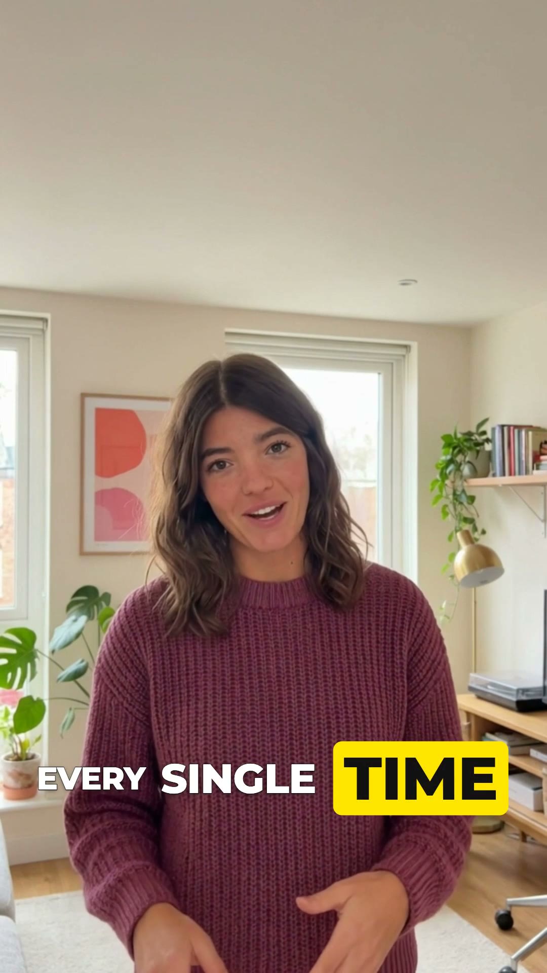
Most short-form video is watched with the sound off, at least for the first second — the second where the scroll decision happens. Captions stopped being an accessibility feature and became the primary retention surface. But “add captions” is like “add music”: the style you pick changes viewer behavior in measurable ways. Here’s a field guide to the styles that keep showing up in high-performing clips, and the perceptual mechanism each one is exploiting.
The foundation: word-timed highlighting
Before any styling decision, the biggest single upgrade is timing. A static block of subtitle text gets read once, in about 400 milliseconds, and then becomes wallpaper. Karaoke-style captions — where the current word lights up in sync with the voice — give the eye a moving target locked to the audio.
The mechanism is audiovisual binding. When what you hear and what you see change together, the brain fuses them into one stream — the same integration that makes dubbed movies feel wrong. A synced highlight recruits the viewer’s eyes into following the voice, and eyes that are following are eyes that aren’t scrolling. Every style below is a different costume on this one skeleton.
Box highlights: Floodlight and Filmstrip
Dropping a filled box behind the active word is the bluntest instrument in the kit, and that’s the point. The box flips figure-ground: for one word at a time, the text stops being marks on the video and becomes an object with its own surface. Peripheral vision picks up the box’s hard edges even when the viewer isn’t reading, so the rhythm registers from across the room.
Yellow dominates this family for a boring, powerful reason: luminance. Yellow reads brighter than any other hue at the same intensity, which is why it survives footage that murders white text — bright windows, beige walls, gym lighting. Black-ink-on-yellow is also one of the highest-legibility color pairs in print tradition (taxis, hazard signs, Post-its). Filmstrip runs the same pair inverted, black boxes with a yellow active word, which trades punch for a cooler, more cinematic register.
Display-weight emphasis: Flashbulb and Dolly
Speech has prosody — some words are simply said louder. Styles like Flashbulb and Dolly translate that into type: setup words run small, and the stressed word lands oversized, outlined, or sliding toward the camera. This is closer to how comic-book lettering works than how subtitles work, and it suits creators whose delivery itself is punchy. The perceptual hook is onset: a new object appearing or scaling grabs attention reflexively, before conscious processing. Use it on the words you’d punch vocally, and it feels like the video is gesturing.
Glow and sweep: Aurora and Searchlight
A glow is functionally a soft outline: it separates letterforms from the background in every direction at once, which makes it the reliable choice on dark or night footage where hard outlines look harsh. But glow also carries genre. Neon says nightlife, music, after-hours confession; a scanning light band says reveal. These styles are doing mood-setting work that would otherwise cost you a color grade. The trap: on bright daylight footage a glow reads as blur. Match the light effect to footage that plausibly contains light.
The depth family: captions behind the subject
The current frontier. When the speaker’s head partially covers the text, occlusion tells the visual system the word is in the room, not on the screen. In-world text doesn’t get filtered the way overlay text does, and it signals production effort that used to require rotoscoping. This family took over 2026’s trend cycle — the red-serif Kumar lockup being the loudest example. We broke that one down separately in The Kumar Template, Explained, and the engineering behind the per-frame person cutout in our matting deep dive.
Choosing: match mechanism to content
| Your content | Reach for | Because |
|---|---|---|
| Teaching, explainers, finance | Box highlights (Floodlight, Filmstrip) | Maximum legibility; the rhythm carries dense information. |
| High-energy rants, hot takes | Display emphasis (Flashbulb, Dolly) | Type that punches when you punch reads as personality. |
| Night footage, music, lifestyle | Glows (Aurora, Searchlight) | Legibility on dark frames plus a free genre signal. |
| Authority content, personal brand | Behind-subject (Kumar, Eclipse) | Depth reads as production value; the face stays unblocked. |
The three ways captions go wrong
- Emphasizing everything. Emphasis is a contrast effect. When every word is animated, colored, and huge, the viewer habituates in about three seconds and you’ve bought noise with your attention budget. One accent word per phrase — the proven templates all converge there.
- Too many words on screen. Past three or four words a line stops being a glance and becomes reading, and reading competes with listening instead of reinforcing it. Every style above caps the line short.
- Style–footage mismatch. Neon glow on a daylight vlog, a hard black box over soft cinematic footage, white text on a white kitchen. The caption is a design element in the frame; it has to obey the frame’s lighting like everything else does.
Quick answers
Which caption style is best for retention?
There's no universal winner — the mechanism matters more than the style. Word-timed (karaoke) highlighting reliably outperforms static subtitle blocks because it gives the eye a moving target synced to the voice. Pick the visual treatment (box, glow, color word) to match your footage and niche, and keep lines to 3–4 words.
Why do so many viral captions use yellow?
Luminance. Yellow has the highest perceived brightness of any hue, so it survives busy, dark, or low-contrast footage better than white — and unlike red it stays legible at small sizes. Pure white disappears on bright skies and white walls; yellow almost never does.
Should every word be emphasized?
No. Emphasis works by contrast with non-emphasis. If every word is big, colored, or animated, the viewer's visual system habituates within seconds and you're back to zero — with extra noise. One accented word per phrase is the sweet spot most proven templates converge on.
Try every style on your own clip
Upload once — Moonshot transcribes, times every word, and lets you flip between all of these templates live. Switching styles is instant; no re-editing.
Open Moonshot free