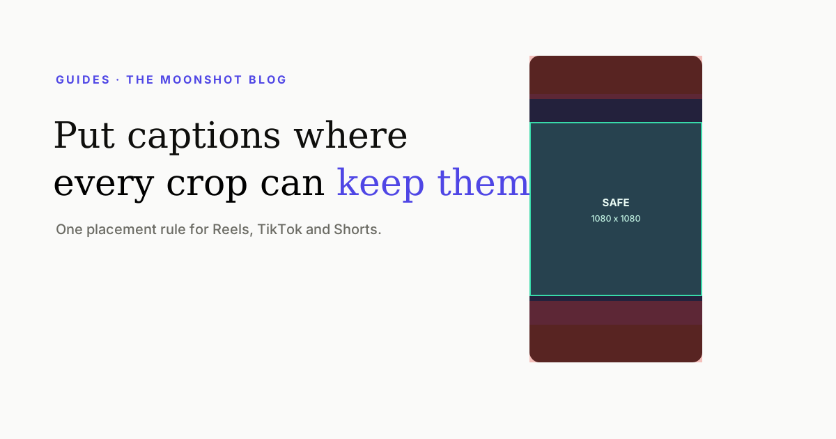
The physical bottom of a 9:16 frame looks like the natural home for subtitles. On a phone it is also where descriptions, account labels and controls live. The durable answer is a band in the lower half of the visual centre—high enough to survive the interface, low enough to stay away from the speaker’s eyes.
The placement rule
This is intentionally less precise than a single pixel coordinate. Platform interfaces change, captions grow from one line to two, and the same export may appear full-screen, in a preview or as a cropped grid tile. A shared centre rule survives those variations better than tracing one app’s current buttons.
The four things captions compete with
| Conflict | Where it lives | What to do |
|---|---|---|
| Platform controls | Right edge and bottom band | Pull the full text block inward and upward. |
| Hook or title | Top third | Give the hook its own moment or keep captions below it. |
| Face and mouth | Upper-middle | Keep the eyes clear; shift the caption slightly down. |
| Demonstration | Often the lower-middle | Move the caption above the action for that shot. |
Why the bottom keeps failing
Subtitle conventions came from screens where the picture owned its edges. Short-form players use those edges as interface. A line that looks comfortably inside the frame in an editor can land behind the post description or sit close enough to the home indicator that it feels accidental.
The fix is not a heavier shadow. Contrast helps against footage; it does not help when another interface element physically overlaps the words. Move the block before styling it.
Do not turn the speaker into a background
Captions belong near the source of the speech, but not on top of the features viewers read while listening. Avoid the eyes and mouth. For a chest-up talking head, the space across the upper chest is often the best starting point: close enough to connect voice and text, far enough from the face to preserve expression.
Behind-the-subject styles are an exception because occlusion creates intentional depth. Even there, the running subtitle should remain readable in front; only the large hero word needs to pass behind the person. See how to place text behind yourself.
Line breaks change the safe zone
A one-line caption can sit lower than a two-line caption without touching the interface. Design for the largest block your style allows, not the average one. Then break at meaning:
- Good: “The part nobody tells you / is the setup.”
- Weak: “The part nobody tells / you is the setup.”
The first version lets the eye read each line as a phrase. The second leaves a pronoun stranded and makes the viewer hold unfinished grammar while the footage moves.
Treat placement as responsive design
Caption position should respond to the shot. A fixed coordinate works until the speaker leans, a screen recording appears, or a product demonstration occupies the same band. Use one default and a small number of deliberate overrides rather than allowing every line to wander.
- Set a lower-middle default inside the shared safe centre.
- Preview the longest two-line block in the style.
- Move whole scenes—not individual words—when the subject conflicts.
- Check the first frame, the busiest frame and the cover frame on a phone.
The cover is a separate composition
Your video frame and profile-grid cover do not have the same job. The cover must survive a centred crop and be readable while static; running captions must survive the player interface and movement. Do not assume a good caption frame is automatically a good cover.
Our Reel cover size and safe-zone guide separates those crops, while the cover-surface guide explains where the still image is actually used.
Quick answers
Where should captions go on a Reel?
Use the lower half of the visual centre, not the physical bottom of the frame. Keep the caption clear of the right-side control column and the bottom interface band, and check that the subject's mouth and eyes remain unobstructed.
Should captions be at the top or bottom of a vertical video?
The lower-middle usually creates the fewest conflicts. Top captions compete with hook text and faces; bottom captions collide with descriptions and controls. Move upward only when the subject or demonstration occupies the lower-middle.
How many lines should video captions use?
One or two short lines. Break at a phrase boundary so each line can be understood as a unit. Three-line blocks cover too much of a phone screen and stay visible long enough to feel like a paragraph.
Can one caption layout work on Reels, TikTok and Shorts?
Yes, if it is designed for the shared safe centre rather than a platform's exact interface. Keep critical words away from the outer edges and bottom band, then preview the export on each destination before publishing.
Keep captions inside the useful frame
Moonshot caption styles use a consistent safe-area layout, then let you preview the final vertical video before export.
Try a caption style