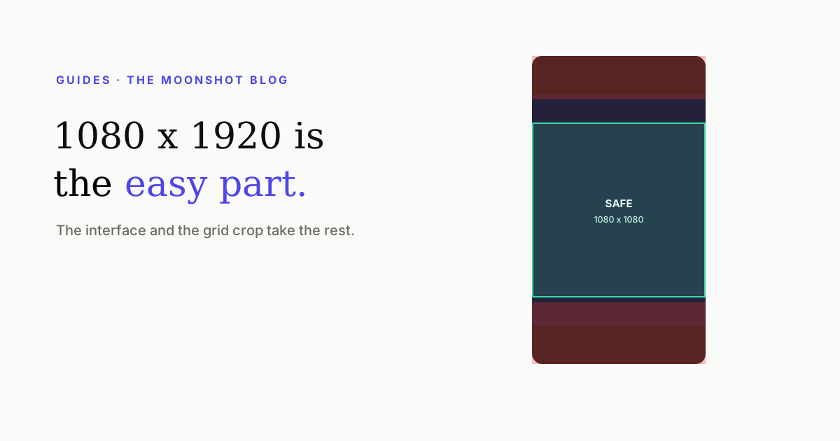
The dimensions are the easy part: 1080 × 1920, 9:16, for the video and the cover alike. The part that actually ruins covers is what happens to that frame afterwards — a chunk of the top and bottom is under the interface, and your profile grid throws away the top and bottom sixths entirely. Here is every band that eats your frame, in one picture, and the single composition rule that survives all of them.
The numbers
| Thing | Value | Note |
|---|---|---|
| Reel video | 1080 × 1920 (9:16) | Also the right export size for TikTok and Shorts |
| Reel cover | 1080 × 1920 (9:16) | Uploaded or picked from a frame of the clip |
| Profile grid tile | ~3:4 centre crop | Top and bottom of a 9:16 cover are discarded here |
| Top interface band | ~14% of frame height | Account row, system status, top controls |
| Bottom interface band | ~20% of frame height | Written caption, audio strip, progress |
| Right button column | ~20% of frame width | Like, comment, share, more |
| Safe composition area | Centre 1080 × 1080 | Inside every crop and clear of every band |
Every band, on one frame
Design 9:16, compose 1:1
That’s the entire method. Build the full-height frame, because that’s what plays in the feed — but treat the centre square as the canvas. Everything load-bearing goes inside it: the face, the headline, the product, the number. The outer bands carry background, atmosphere, the rest of the body, the room.
Three practical consequences:
- Captions sit centre-ish, not low. Text parked near the bottom looks balanced in your editor and lands under the caption tray in the app. Middle-to-lower-third is the sweet spot.
- Headlines on covers go in the middle third, not the top. A headline across the top of a 9:16 cover is invisible on your own profile — the place it most needed to work.
- Keep the right fifth free of anything you need read. The button column sits over it, and it’s where a thumb rests.
Cross-posting without redoing the layout
TikTok and YouTube Shorts have the same structural problem with different measurements: an interface top and bottom, a button column on the right, and their own cover crops. Chasing three sets of exact values is a losing game because all three move. Composing to the centre square satisfies all three simultaneously — which is the real reason it’s worth making a habit rather than a checklist.
How Moonshot handles it
Caption placement is solved against the frame rather than dropped at a fixed offset: lines are kept inside the safe band, and on behind-the-subject templates the placement engine also searches for a position where the speaker actually occludes the word without burying it. On the cover side, generated thumbnails keep the headline inside the centre square precisely so the grid crop can’t eat it — the failure described in the covers article.
The practical upshot: you don’t position anything by eye against a phone mock-up. You pick a template, and the layout already respects the bands above.
Quick answers
What size is an Instagram Reel cover?
1080 × 1920 pixels, 9:16. But the profile grid centre-crops it to roughly 3:4, so only the middle portion is guaranteed to survive. Design at 1080 × 1920 and keep everything that matters inside the centre 1080 × 1080 square.
What is the safe zone for Instagram Reels?
As a working rule: leave roughly the top 14% and the bottom 20% of the frame free of anything load-bearing. The top band carries the account row and system UI, the bottom carries the written caption, audio strip and the like/comment/share column on the right.
Does the safe zone differ between Reels, TikTok and Shorts?
The principle is the same — interface on the top and bottom, a button column down the right — but the exact bands differ and they change with app updates. Composing to the centre square satisfies all three at once, which is why it's the rule worth memorising instead of three sets of pixel values.
Why does my caption text get cut off in the grid?
Because the grid isn't showing your 9:16 frame, it's showing a ~3:4 centre crop of it. Text placed near the top or bottom of the full-height design is outside that crop and simply doesn't exist on your profile.
Can I just design everything in the middle?
Essentially, yes — that's the whole trick. Use the outer bands for background, atmosphere and the subject's body; put faces, headlines and any text in the centre square. It costs you nothing and makes every crop and every interface change survivable.
Captions and covers that stay inside the lines
Moonshot places captions against the real frame and keeps cover headlines in the safe centre — so nothing you make disappears under the interface or the grid crop.
Open Moonshot free