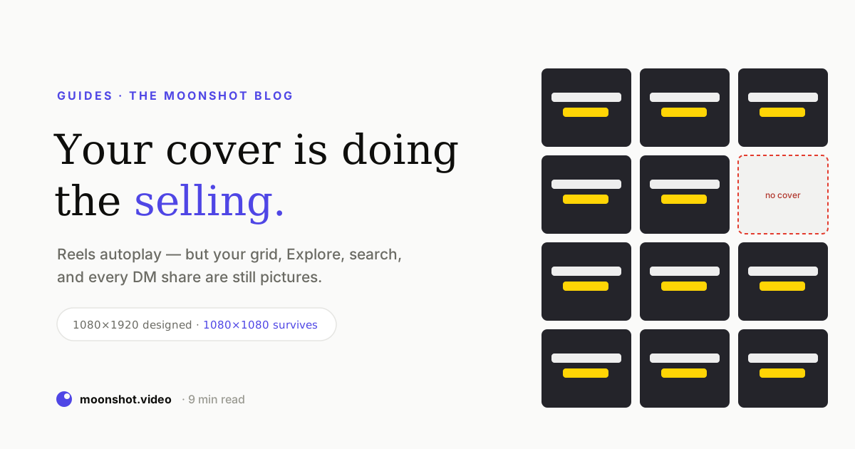
On YouTube, nobody argues about this: the thumbnail is the product and the video is what you get after you buy it. On Instagram, the same creators shrug — Reels autoplay, so why would a cover matter? It matters because autoplay covers exactly one of the places your clip shows up. Everywhere else — your grid, Explore, search, the suggested rail, a friend forwarding it in a DM — your video is a photograph that someone has to choose to tap. Those are views you have already earned the impression for and are declining to collect.
The autoplay illusion
The reasoning behind “covers don’t matter on Instagram” is sound as far as it goes. In the Reels feed the video does start playing on its own, so the first frame is just the first frame and your opening three seconds do the work. Fine. But the feed is the surface where the platform decided to show you to someone. Every other surface is one where a human is choosing between options — and on all of them, your clip is a still.
Notice which side of that diagram contains the non-followers. Feed distribution is allocated to you. Grid taps, Explore taps, search taps and DM opens are won, one thumbnail at a time, against everything else on screen. A cover isn’t decoration on those surfaces; it’s the entire pitch.
Your grid is a portfolio, and it compounds
The single most valuable surface is the one creators think about least: the profile grid. Consider what a profile visit actually is. Someone saw one clip, liked it enough to tap your name, and is now looking at nine rectangles to decide whether you are worth following. That is the highest-intent moment in the entire funnel, and it is adjudicated entirely on still images.
Two things follow from that:
- Covers are read as a set, not one at a time. Nine covers that share a type treatment, a colour, and a crop read as a body of work. Nine unrelated frames read as someone posting. The consistency is doing as much work as any individual image.
- Old posts keep selling. A feed impression happens once. A grid tile keeps being seen by every future profile visitor. A good cover on a clip from four months ago is still collecting views this week — which is the closest thing to free distribution the platform offers.
The crop tax nobody accounts for
Here’s the mechanical detail that quietly ruins otherwise good covers. You design at 1080 × 1920, because that’s the Reel. But the profile grid doesn’t show a 9:16 tile — it centre-crops to roughly 3:4. A headline sitting handsomely near the top of your cover simply isn’t there when the grid renders it.
The working rule: design 9:16, compose 1:1. Put the face, the headline and anything else load-bearing inside the centre square. The outer bands are for background only — they exist for the feed and are forfeit everywhere else. The same instinct protects you from the interface: usernames, buttons and the caption tray sit over the top and bottom of the frame in the feed, so the centre band is also where your text survives the UI.
What a cover needs to contain
A thumbnail is read at about the size of a postage stamp, in a mosaic, by someone who isn’t trying. That constraint dictates almost everything:
- Two to five words, enormous. If the text isn’t legible when the image is 120 pixels wide, it isn’t on the cover. Heavy condensed sans faces earn their popularity here — they fit more letterform per pixel of height than anything else.
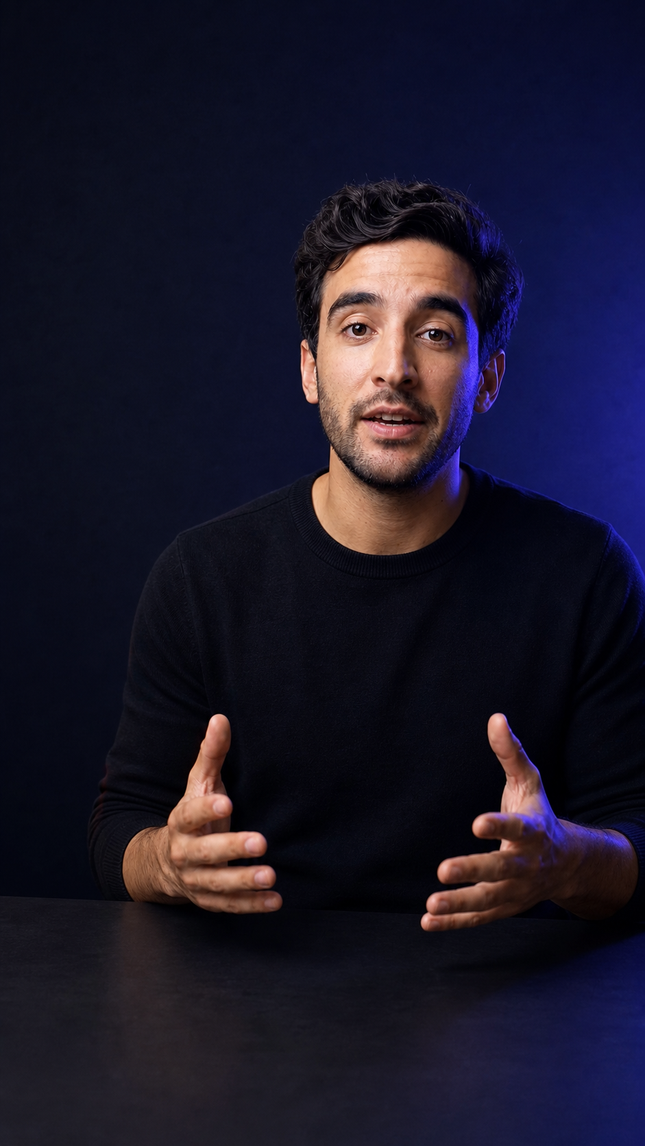
- A face, with an expression. Faces are found by the visual system before anything else in the frame, and an expression implies a story. A neutral mid-sentence face implies a paused video.
- One idea, high contrast. Dark subject, light text, or the reverse. Busy backgrounds behind text are the most common reason a cover reads as grey mush at thumbnail size — a solid or blurred band behind the words costs nothing and fixes it.
- The same promise as the hook. The cover and the opening title card should say the same thing. A cover that promises something the first three seconds don’t deliver buys you a tap and an immediate exit, which is worse than no tap.
- A recognisable family. One accent colour and one headline font, used across every cover, is what turns nine posts into a brand at a glance.
you this part
The default option is the worst option
Left alone, the platform picks a frame for you. That frame is chosen for being a representative moment, not a persuasive one — which in practice means a mid-blink, mid-word, mid-gesture still. It is the one option guaranteed to contain no text, no expression chosen by you, and no promise.
This is the part that reads as “free views left on the table.” The impression was already served. Someone already arrived at your grid or scrolled past your tile in Explore. The only variable left was whether the picture gave them a reason, and the default answer is no.
YouTube: same rules, harder money
Everything above applies to Shorts, and long-form raises the stakes rather than changing them. On YouTube the thumbnail is the advertisement and the title is the caption underneath it: search results, the suggested column, the subscriptions page and the home grid are all thumbnail-first. The differences worth knowing:
| Surface | Shape | What to optimise |
|---|---|---|
| Instagram feed | 9:16 video | The first three seconds — the cover is bypassed |
| Instagram grid / Explore | ~3:4 crop of the cover | Centre-square composition, 2–5 huge words, consistent look |
| YouTube Shorts shelf | 9:16 still | Face + short headline; assumed sound-off |
| YouTube search / suggested | 16:9 thumbnail | Contrast, one subject, text that doesn’t repeat the title |
| DM share / embed / link preview | Cover still | Legibility at small size; the promise readable without context |
Making one without opening a design tool
The reason most creators skip this isn’t disagreement — it’s that designing a cover means exporting a frame, opening another app, setting type, and re-uploading. So Moonshot builds the cover from the video you already uploaded.
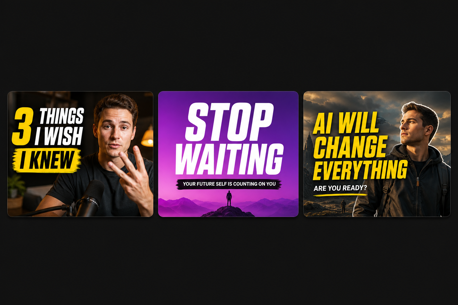
- Frame mode (free). Vision picks the strongest frames of you out of the clip — eyes open, expression intact — and you drop a headline onto one and download. No image generation, no cost.
- AI scene mode. Cuts you out of the footage and composites you into twelve fully-rendered scenes — cinematic, 3D, comic, neon — each with its own palette and camera angle, and a headline baked in.
- Headlines from your own transcript. The same model that writes your opening hook proposes cover lines from what you actually said, so the promise on the thumbnail is one the video keeps. Or type your own and it’s baked into every variant.
- 16:9, 9:16 and 1:1. One video, the shapes each platform wants — with the headline kept inside the safe centre so the grid crop can’t eat it.
Quick answers
Do thumbnails actually matter on Instagram if Reels autoplay?
Yes — because the feed is only one of the places your Reel appears. On your profile grid, in Explore, in search results, in the suggested rails and in a DM share, the clip shows up as a still image that someone has to choose to tap. Autoplay covers one surface; the cover covers all the others, and those others are where non-followers find you.
What size should an Instagram Reels cover be?
Design at 1080 × 1920 (9:16), but keep every important element — face, headline, product — inside the centre 1080 × 1080 square. The profile grid crops covers to roughly 3:4, so the top and bottom of a full-height 9:16 design gets sliced off. The centre square is the only region that survives every crop.
Should the cover have text on it?
On the grid and in Explore, yes — two to five words, large enough to read at thumbnail size on a phone. That's the difference between a still that says what it is and one that's just a frame of a person mid-sentence. Keep it in the centre band so the crop doesn't eat it.
Is the cover the same as the first frame of the video?
Not necessarily, and it usually shouldn't be. You can pick any frame from the clip as your cover, or upload a designed image. Left alone, the platform picks a frame for you — which is how you end up with a grid full of mid-blink faces.
How do I make a thumbnail from my video quickly?
Moonshot's thumbnail maker pulls the strongest frames of you out of the clip and lets you drop a bold headline onto one in a few seconds, in 16:9, 9:16 or 1:1. There's also an AI mode that cuts you out and composites you into twelve generated scenes if you want something beyond a frame grab.
Turn your clip into a cover in under a minute
Upload a video and Moonshot pulls your best frames, writes headline options from your own words, and renders covers in every shape you need — free to start.
Open the thumbnail maker